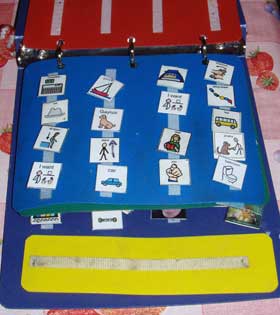
My daughter, Siobhan, uses the Picture Exchange Communication System.
See: http://www.pecs.com/WhatsPECS.htm

For some time, Siobhan was making icon placement errors. The icons and a sentence strip are held in a hard plastic notebook on Velcro strips. The way she uses PECS (she’s at Phase V with a very little bit of Phase VI emerging) she picks up an “I want” icon and puts it on the sentence strip. Then she goes shopping through the book for “taco” or “car” or whatever she wants. She wants taco and car a lot lately. She then puts the “taco” icon on the sentence strip to the right of the “I want” icon, rips the sentence strip off the velcro strip binding it to the book, and hands the sentence strip to her communicative partner. That’d be me. “I want taco” I say to her when I get the strip. After I say it she sometimes points to the icon of the thing she wants, just to make her point stick. I am, after all, by her definition, slow on the uptake, being her Dad.
We had the book arranged so that “I want” was in the left lower corner and “bathroom” was in the right lower corner of the first page. Siobhan kept returning the “I want” icon out of place. When requesting bathroom, or any of the many other things on the first page, she would frequently put back the icon in play in the place where “I want” had a home, then get confused about the placement of “I want.” This is partly due to the fact that she deconstructs the sentences in the reverse order in which she builds them. A sentence “I want” and “bathroom” would mean that she’d be returning the “bathroom” icon to the book first, and then the “I want” icon.
It was the responsibility of the communicative partner to rearrange the book so that “I want” was in the left lower corner and “bathroom” was in the right lower corner of the first page. Being slow on the uptake, we let this go on for years, scrambling to rearrange the book before the next sentence was constructed, sometimes in rapid fire succession. Whew!
Suddenly it came to me. We should make Siobhan’s experience maintenance-free. We should follow what she does, and not have her following what we do. This is a basic spiritual principle. If someone is involved in the results of a decision, they should be involved in helping to make that decision. Siobhan is completely non-verbal. She can’t tell us what she wants. But we can learn from her, if we are teachable. In the same way, by using tools to analyze Web usage, we can learn from our Web users.
I got a new blank page and inserted it into her book. I then moved “I want” and “I see” and “bathroom” to that page. I showed her the new arrangement. It only took two exchanges and she got it. She’s got cognitive challenges, but she’s quick on the uptake when it comes to communications. After this change, she was returning “I want” to the first page after first putting away the other icons on other pages. She was still returning “bathroom” to the left lower corner when she requested bathroom, but she then placed the “I want” icon directly above it since there is plenty of room on the nearly empty first page.
My wife, Linda, made a change in this scheme. She placed “bathroom” on the right lower corner of the second page. Now Siobhan is replacing “bathroom” there most of the time. We learned from Siobhan’s usage and are not forcing her to know what it is we want her to do. Similarly, we should learn from our Web users what it is they want to do, what they want to accomplish, what links are important to them as opposed to what links we think are important.
At work we are going through a mainpage change to simplify it and delete many of the items there now. This is what actually spurred my epiphany with Siobhan’s PECS book. Simplify the mainpage… of course!
Analysis of Web usage can be greatly aided through the use of heatmaps. Jakob Nielsen wrote a piece about the use of heatmaps:
http://www.useit.com/alertbox/reading_pattern.html
But you don’t have to pay for expensive eyetracking studies. You can get a similar benefit by using the following Web services:
http://crazyegg.com/
http://www.fusestats.com/
http://clickdensity.com/
You can also do it yourself with:
http://www.labsmedia.com/
http://clickheat/index.html/
http://blog.corunet.com/english/the-definitive-heatmap/
In addition, there’s an Add-On extension for Firefox here:
http://www.feng-gui.com/tools.htm
Use the heatmaps to find out what is important to users and rearrange your pages accordingly. Of course, use of these services depends on having a certain degree of visual acuity or the help of a person who does. I know that crazyegg.com has list views of the raw data, and they use separation of structure and presentation with CSS/XHTML, but I haven’t tested their pages for accessibility. That’s another story.
