 This is the Part I of the three-part series of “Based on Web Accessibility: Who Would You Vote For?.” Taking out all the politics, all their policies, the tears and hair, the compelling stories. Just condense your judgment into the topic of Web Accessibility. So, to start, I ran an automated scan using AccVerify/Repair® scan of the Hillary Clinton website (www.hillaryclinton.com). And here are my findings.
Out of 271 pages, 79 pages passed automated validation, based on Section 508. Note: This did not include the blog (blog.hillaryclinton.com). Most of the failure comes from missing alternate description for images, 384 missing ALT attributes to be exact. For example in her campaign web site’s homepage, the main banner image that calls for action does not even have an Alternative text.
Now for the 10 Checkpoints — I’ll give 1 full point for every passing check point:
1. Use of Color – FAIL
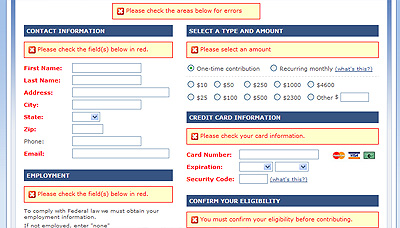
I ran a gray scale simulation, it seem to have adequate color contrast, and the information conveyed is still available. BUT GUESS WHAT? On the Contribute form page, when you hit submit and you are missing information. The alert says “Please check the field(s) below in red.” Not too color friendly!

2. Use of Images – FAIL FAIL
As the AccVerify® automated report stated, most of the errors it found in the pages do not have an alternative text. This includes the main banner with a message to CONTRIBUTE. I took special notice at the “About Hillary” page (http://hillaryclinton.com/about/mom/). When I turned off the images, the timeline navigation simply vanishes. Yikes!
3. Flexible Page Design – PASS
At 1024 by 768, which most users have their screen resolutions are set, the website works optimally. But for the users who use a lower resolution, such as 800 by 600, most vital information remains hidden, the main navigation, and the solicitation campaigns.

4. Structure vs. Design – HALF CREDIT
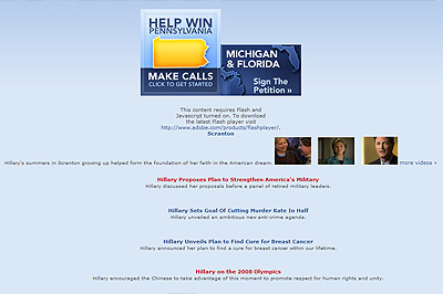
Once I linearized the page (see photo) the information became disjointed. Even though the navigation stayed stable, other information began moving in different places, such as the news and the video section. There are no structure in the document. I ran a structure report and only found four (4) H2’s there are no H1’s nor H3’s that could easily organize the information. On a brighter note, there are uses of the List Items to itemize content such as the navigation. I saw this when I turned off the CSS. The “Help Make History” section could have been a list as well.

5. Easy, Consistent Navigation – PASS
There is an easy, consistent navigation across the campaign web site on top. Tabbing across the main navigation is easy. But when I try to get to the drop down, there is no avail. The drop down does not show up when the Javascript is turned off. WA WA WAAA…. By the way, I would also suggest a Skip Nav.
6. Use of Scripts and Forms – PASS
Kudos to the programmer who put label tags in the web forms. Going back to the AccReports, it returned back some warnings on self-labeling. Other than that, the web forms are great. This is good because most of solicitation on the website heavily relies on these web forms. When JavaScript is turned off, the video functionality also turns off (relies a lot on the swfobject script to call out Flash). Other than that, the web site’s information can still be accessed even with the JavaScript turned off.
7. Use of Multimedia – FAIL
Did I see any captions? I don’t think so. There’s a video in the home page of her childhood that would have been great if it had at least an option to turn on captioning. This is the same story to all of the videos on Hillary’s website. In addition to this is another accessibility “NO NO” video that auto starts. Not only is it not a good practice, but a nuisance if you have your volume “unexpectedly” on MAX.
8. Use of Frames – TECHNICALLY N/A BUT PASS ANYWAY
I found NO frames on this website. I will have to look closer if I find any IFRAMES…
9. Use of Tables – PASS
There is a limited use of tables, specifically for layout. The website is mainly in CSS.
10. Use of Graphs and Charts – OHHH FAIL
The largest use of graphs and charts is in the homepage’s main promotion image about Closing the Gap. It shows the amount the campaign had spent for advertisements in Pennsylvania versus how much money was raised. Well… without any sort of Alternative Text the information on the graph was deemed useless.
Sen. Hillary Clinton’s website gets a 5.5 out of the 10 possible points. Which gets a resounding “F” for Blacktelephone sites!
Up next… Sen. Barack Obama’s site. Maybe we’ll see a “change” there!
