whitehouse.gov

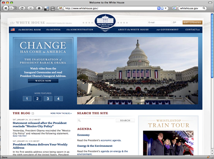
Since David did such a great job of reviewing the candidates’ Websites and in response Obama’s team actually fixed some things on their site, I thought I would review the brand new www.whitehouse.gov site that went live on the 20th.

You can read my comments on everything from use of images to multimedia here: www.patriciarees.com/whitehouse/

Screenshot of www.whitehouse.gov

In general, I was surprised that they missed some pretty simple things like a few important images without equivalent text, a broken search form when javascript is off, but they got the harder things like captioning their videos.

I’m going to send them my review, since the site asks for accessibility comments and help. Hopefully they can be as responsive as the campaign Website team was.

E-commerce for the blind

It’s good business — and it’s the law — for companies to make their websites fully accessible to the visually impaired.
The Americans with Disabilities Act requires “public accommodations” to be accessible to the disabled as well as the able-bodied. That’s why stores, government buildings and churches have elevators and ramps, not just stairs. But when the National Federation of the Blind urged retail giant Target Corp. three years ago to modify its website to aid the visually impaired, Target balked. The disabilities act applied to its brick-and-mortar stores, not its branch in cyberspace, Target’s lawyers argued. Continue reading “E-commerce for the blind”